Quiz - Catalog Marketing
Merchandising 101
Anatomy of a Winning Product
Catalog Merchandising
Catalog Marketing 101 Tutorial
Catalog Marketing Overview
Catalog Marketing Checklist
Catalog Creative Strategy
Catalog Design
Catalog Design Checklist Tips
Catalog Copy Checklist Tips
Catalog Review Checklist
Retail Competitive Analysis Checklist
To find out more about our marketing applications, products and services, click here or call us today at (651) 666-0934.
 Catalog Layout & Design Checklist Tips
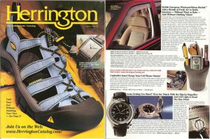
Whether you're designing a consumer or business-to-business catalog, keep all of these factors in mind to improve the results of your catalog.
- The catalog should be the appropriate number of pages for the number of products offered.
- Space allocation for the products should be based on importance of the product, and how much space is required to properly present it.
- The catalog should use devices such ideas, letters, cooking instructions, history lessons, receipts and quotes to keep the reader engaged.
- The catalog pagination needs to be well organized and it needs to make sense to the customer as she looks at it.
- There should be a hero product presentation or several in the book to add drama and break up the monotony.
- High impulse products that can fill out the customer purchase should be featured surrounding the order form.
- The back cover of the catalog should feature new products.
- The merchandise needs to be the star of the spreads, the catalog.
- The products need to be well organized, and for a catalog with a lot of product categories and / or a large number of pages, the use of a table of contents will make the catalog easier to shop.
- Page 2 when possible should include important customer information.
- The strongest products should be on the inside front spread and the products should be representative of the rest of the products offered.
- If items are paginated along a theme, they need to be consistent to that theme.
- Unique merchandise should be chosen for feature slots.

